
fresh: organic & fast Eats
Timeline
Sept 2018—Nov 2018
Constraints
Solo UI/UX designer
General Assembly UX Design
10-week project
ROLE
User interviews & competitive analysis
Affinity mapping & personas
IA & card sorting
User flows & prototyping
Usability testing
UI design & style guide
Low-fidelity wires & high-fidelity comps
defining the problem
When I joined the corporate world, I quickly realized there was a complete lack of organic, non-processed, or fresh food that was easily accessible and affordable.
As someone who immediately feels the digestive impact of not eating clean, I sought to close this gap.
The fix
Fresh aims to fill the gap in the corporate world for fast and easy access to organic and non-processed food.
Fresh hosts local restaurants, smoothie bars, cafes, and markets that have a 100% organic menu.
Rewards within the app offset the cost of organic food and encourage corporate professionals to maintain their healthy eating habits.

visual design
Style guide & Brand
The Fresh color palette imparts a clean, bright, and exciting feeling to the user.
The typeface Proba Pro is used in a variety of fonts to evoke a feeling of warmth and youth.
The brand name Fresh speaks to a fresh start for accessible organic food and the quality of the food offered from the service.

research & discovery
User interview Insights
People struggled to maintain healthy eating when they don’t have time to cook.
People preferred to buy organic when they get their paychecks due to the higher cost.
People strived to eat healthy every day, in order to have more energy and fuel their body, but it’s hard to maintain when life gets in the way.
persona


Competitive analysis
Fresh clearly outperforms its competitors. The “healthy” foods that competitors offer contain highly processed, modified, and non-organic ingredients.
Information Architecture
Taxonomy
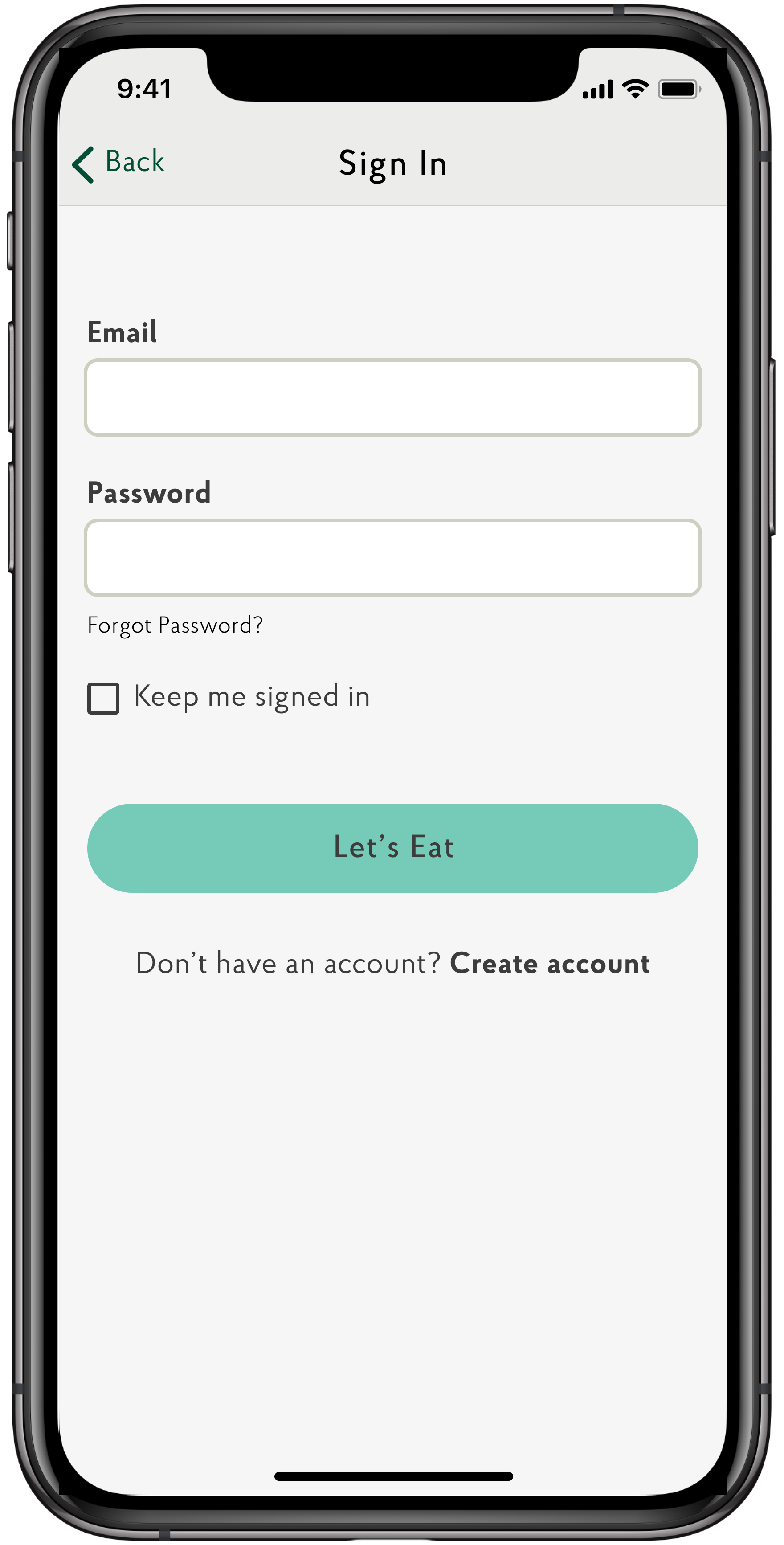
1.0 Sign In
2.0 Create Account
3.0 Account
3.1 Profile Information
3.2 Order History
3.3 Favorites
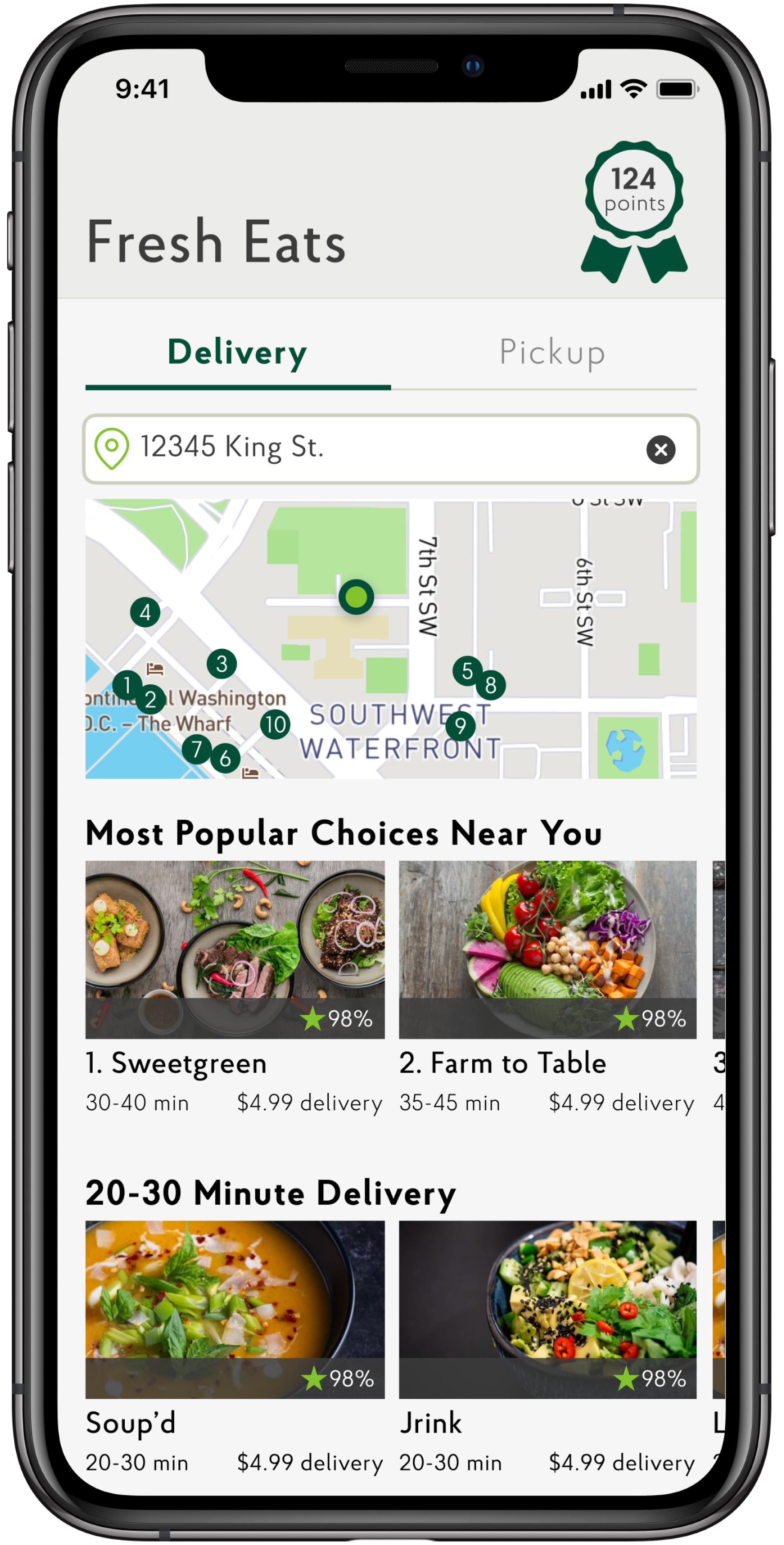
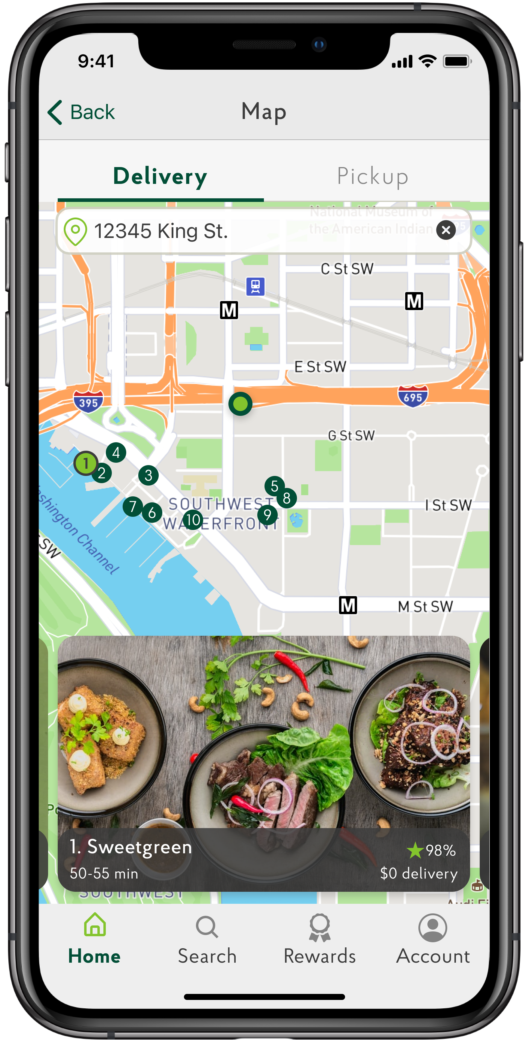
4.0 Home
4.1 Location Search
4.2 Map
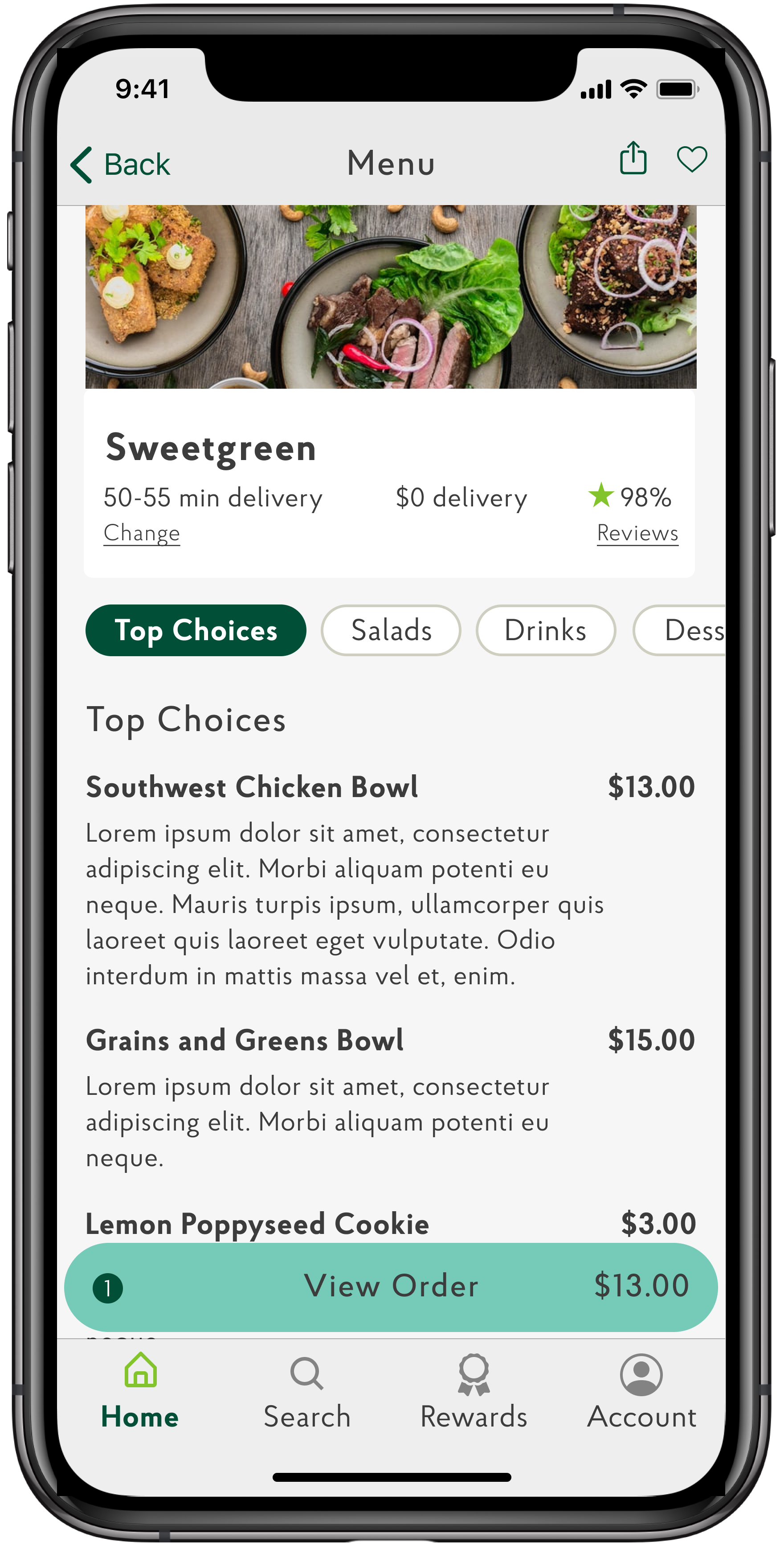
4.3 Top Choices
4.4 Fastest Delivery
5.0 Search
6.0 Rewards

*Search was removed from Home; Top Choices and Fastest Delivery were added to Home
Card Sort
Users logically associated Favorites and Order History within their Account information, as opposed to features within the Navigation.
Designing the Product
sketches
Delivery flow, critical path.
usability testing insights
First Round (lo-fi)
Users wanted to see exactly what is offered closest to them first, regardless of pickup or delivery.
Users wanted to know which restaurants had the fastest and lowest cost delivery.
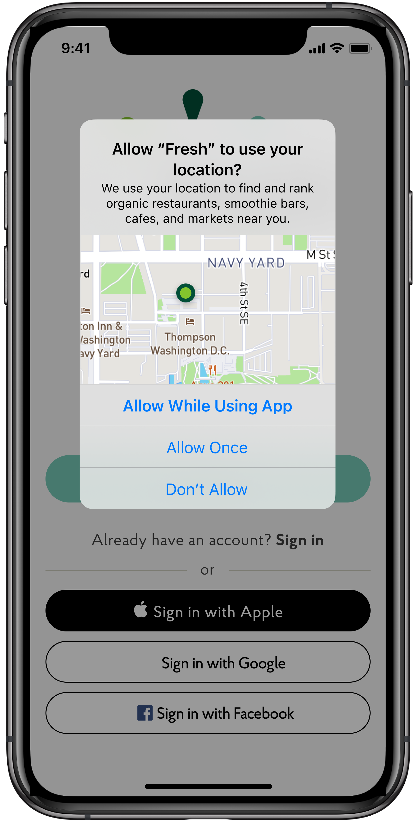
Users wanted additional sign in and payment methods.
Second Round (hi-fi)
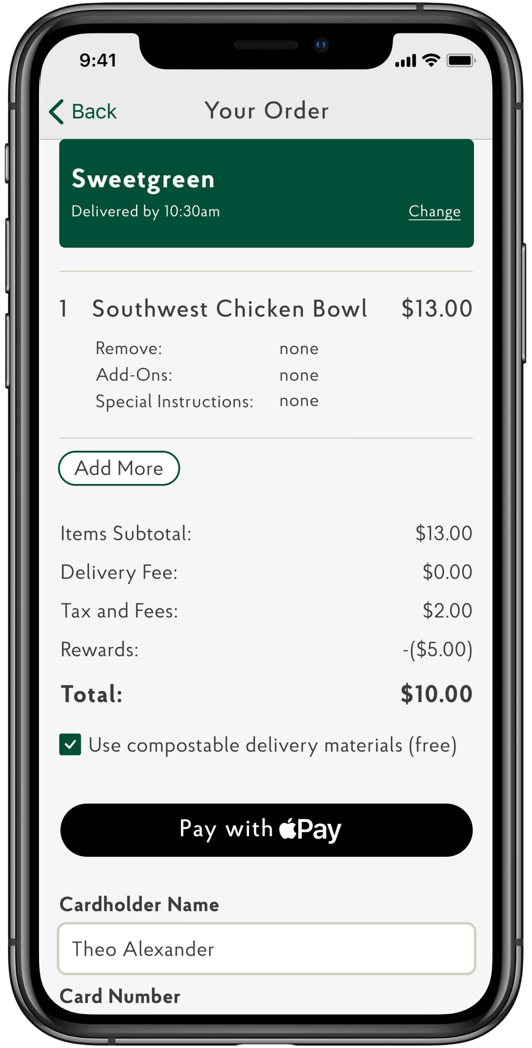
Users wanted to see the popularity rankings and reviews for each restaurant closest to them on the map.
Users wanted to see how their rewards points reduced their order total cost.
Low-fidelity wires

High-Fidelity Comprehensives
The future
lessons learned
Ask for design feedback as early in the process as possible, especially when designing solo.
Design Backlog
Add a View All feature to each horizontal scroll section on the homepage.
Create the reward system user flow to help offset the cost of pricier organic food.
Create the account profile where the user can view their order history and favorites.
Incorporate delivery driver tips.